By Mark Hinshaw – Crosscut, April 26, 2016.

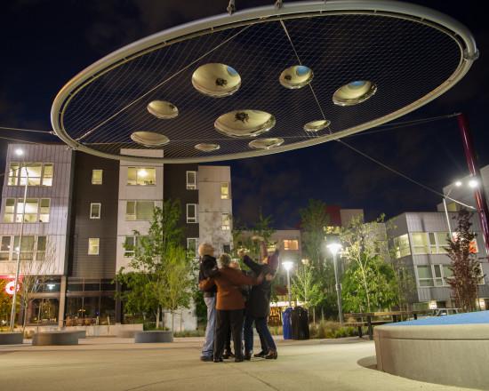
Ellen Sollod’s “Cloud Veil” at 12th Avenue Square Park. Credit: Seattle Parks & Recreation Credit: Alex Garland
Forget what you think you know about green Seattle parks. A new park just south of Seattle University shows us an important aspect of the future in a more densely developed city.
The recently opened 12th Avenue Square Park is the sort of open space we will likely see more often. It is more like a piazza, surrounded by development — both older and newer, with more buildings to come.<–more–>
Seattle has a long tradition of building fine parks. The early 20th century’s Olmsted Brothers plan gave us long sinuous greenbelts following topography and shorelines, and great swaths of mature trees that seem to weave the Cascadia forest right into the middle of the city. The closure of two expansive military bases gave us two magnificent natural parks adjacent to water, Discovery and Magnuson. The Port of Seattle has added more public spaces. Former landfills and industrial sites along waterways have been converted to usable open space. And Seattle voters have for decades consistently approved tax increases to fund more parks.
Yet reports by the city indicate that some parts of Seattle continue to have open space deficits. Dealing with those will require different approaches, including putting smaller parks in the heart of neighborhoods where more people are living.
We in the Pacific Northwest value large verdant open spaces with a pristine, pastoral character. We like doing stuff outdoors, whether it is hiking, biking, boating, skiing, or just plain old strolling. We are lucky to live in a part of the world where in some months, you can do all of the above within a short distance away.

Credit: Seattle Parks & Recreation
But 12th Avenue Square is a new kind of open space that we are beginning to appreciate — one not necessarily defined by flora and fauna, topography or hydrology. We also want spaces that are active, energized, filled with people and may include expressions of art.
This type of space often involves no vegetation at all, but rather sets up a literal stage where people and performances change all the time. In a sense, we are finally learning to emulate the lively urban spaces in European cities.
For Seattle, this has not come without some painful lessons. In the past we built natural parks and pretty much stopped there. That is simply not possible with urban parks which have more to do with human behavior and economics than natural resources. Indeed, urban parks require two things to keep them successful — frequent maintenance and on-going programming.
We learned this lesson with both Westlake Park and Occidental Square. Over the years, both places were becoming social cesspools of drug use and dealing, aggressive panhandling and daytime encampments. Fewer and fewer people felt comfortable using them. They were places you quickly passed through rather than lingered in.
In the last year, however, mostly due to the contributions of companies and civic organizations, both places have been completely transformed. Tables and chairs are set out in the morning, and food trucks attract people from 11 a.m. to 2 p.m. People play ping-pong, take yoga classes, shop in occasional tent markets, and listen to music. Changing art is part of the picture. There are still people from the complete spectrum, including the homeless. But both public spaces are immensely more usable and welcoming.
The best part is that you can now see young children using these spaces, as more families with children live downtown.
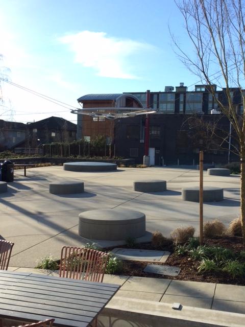
The new 12th Avenue Square Park seems designed to work well from the start. As with many classic urban spaces, this is about horizontal surfaces. European spaces often provide a floor that is rich in texture and loaded with spots to sit, whether its ledges, steps, benches or portable chairs. The 12th Avenue space has a floor with a swirling design and disks that pop up to sit on.
It also has a second horizontal element, a circular ring of steel that is suspended by slender cables, forming a kind of ceiling. Designed by artist Ellen Sollod, this element offers much more than the often-seen string of lights, which designers can specific from a catalog without much more effort than clicking a mouse.
Sollod’s piece is, well, solid. Entitled Cloud Veil, the piece visually defies gravity by placing an arrestingly heavy object directly over our heads. It marks the place and contains it – Attention s’il vous plait! The shallow polished bowl shapes hovering inside the ring pick up ambient light and reflect it back, as if they were lighted themselves. The feeling is not unlike the scene in Close Encounters when the mothership descends close to the ground.
There is something special here. This is a place that is especially enjoyable at night.
Hewitt Architects was the overall designer but the close architect/artist collaboration is evident. This is not a case where the artist comes in later with a “site-specific piece.” Here the site design and the art are fused together. Its hard to tell where one stops and other begins. Moreover, the space is simple, coherent and bold. (Lately there has been a tendency to load public spaces like baked potatoes, piling on such toppings as lights on sticks, bricks for paving, and benches without backs. These are the bacon bits, grated cheese, and chives of urban design.)
Hewitt also designed an elegant “woonerf” — a slow-moving, quiet, narrowed street that allows for walking and biking — next to the square. Unlike Bell Street, in which a Belltown street was forced to be a park, this design provides a safe, serene, car-free space next to a transportation corridor. Everyone is accommodated without signs futilely trying to alter the errant and entitled behavior of drivers.

The 12th Avenue park offers a prototype for future urban parks that we will need as we become more dense as a city. It is compact and doesn’t require buying a lot of costly land. It has “eyes” on it from the adjacent businesses and apartments. It is open and accessible and can easily accommodate neighborhood scale events and programs. Best of all, it is magical: It makes you gaze with wonder. It doesn’t get much better than that.
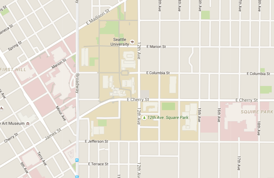
The park sits on a plot of land barely bigger than a single-family house lot. At a little over 7,000 square feet, its tiny by comparison to most other parks. But its value socially as a dramatic town square for the Squire Park neighborhood is enormous. That neighborhood — one of the least well-known in Seattle but a rather distinctive part spot overlapping part of Capitol Hill and the Central District — has long needed a sense of center.
This park definitely gives it one. And it provides a model of what can work in other neighborhoods as we continue to become a more mature, diverse, and dense city.,
This article was originally posted in Crosscut – No Room for Trees in Seattle’s New Parks
